

In the past, our scientists have assigned ranks to climate divisions and states to help place monthly, seasonal, and annual temperatures and precipitation amounts into historical context. With our new temperature and precipitation percentile maps, you can get a more detailed look at U.S. climate conditions than ever before. These new maps use that same ranking system but for 5-kilometer-by-5-kilometer squares across the country—each roughly one-and-a-half times the size of New York City’s Central Park—to give you a better understanding of the climate conditions in your backyard.
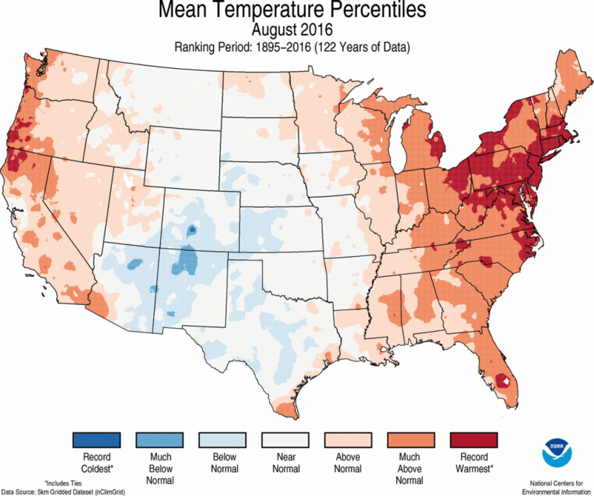
Our scientists used sophisticated, new methods of data science along with our nClimGrid dataset to create these maps. They compared the values for each square with its own historical record and sorted the values from lowest to highest. Then, the scientists assigned a rank to each value based on its position within the sorted list of all values.
Why do these maps look different?
Because the squares on the new maps are much smaller than the climate divisions, ranking each of them provides a more detailed view of regional patterns. For example, take a look California in the August 2016 divisional precipitation ranks and percentiles maps. Varying conditions in larger climate divisions can essentially “cancel each other out,” giving the division as a whole a rank near normal.
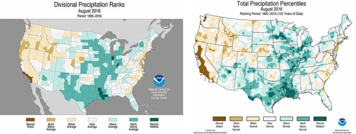
Our divisional ranks maps aren’t going anywhere. They’ll remain a part of our suite of national temperature and precipitation maps that include national, regional, statewide, and divisional ranks maps.


